In this blogpost, we’re going to talk about the Art Direction and creative constraints! To do that, we’ll hand over to Jacques, our art director.
Hello everyone!
Today, we’re going to tackle a few of the different art choices that we made during the development of “The Last Spell”.
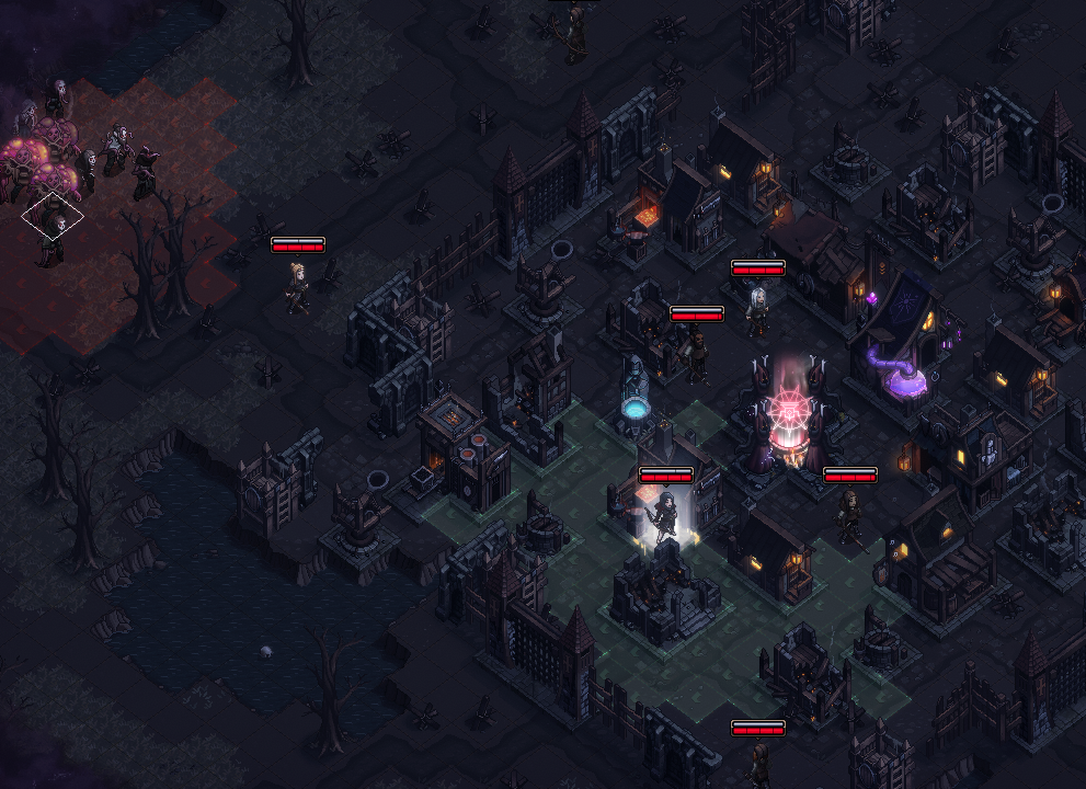
With this aim in mind, we need to go back to the project’s origins and try to understand how we went from the concept art (late 2018!) to this screenshot (early 2020).

For us artists, a very important difference between those 2 pictures is probably the method used to make them: “classic” digital painting in the concept art and “pixel-art” in the final game.
But why did we go from the first to the second one? That’s what we’re going to find out today as we talk about the game’s art direction.
The early days of the project
When you start to work on a new game project and you only have mental representations of your future “masterpiece”, the hardest thing to do is put a “vision” in place. Ideally, you need:
- That this vision is as clear and understandable as possible, including for you (that’s quite complicated).
- To share the same vision with the other team members (that’s very difficult).
- Not to divert from this vision during the development (that’s impossible).
Easier said than done, particularly when you’re facing the infinity of choices that a game development represents, in which you want to put too many things at first.
To make this complex process easier, we’re taught in game schools (yeah, that’s a thing), that you need to identify the pillars of the experience that you’re offering to the players and try to base all your decisions upon those pillars.
The Last Spell – An asymmetric tactical
And what was the very first pillar of “The Last Spell”, you’re wondering?
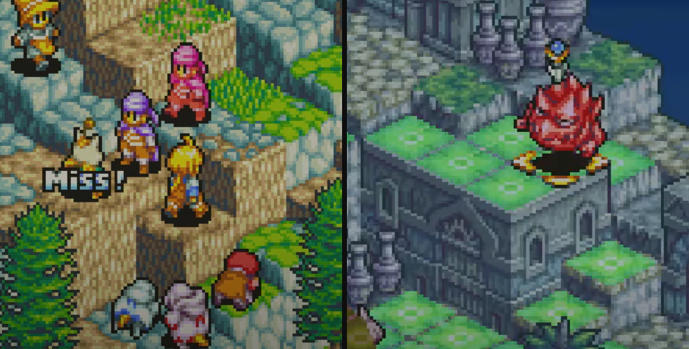
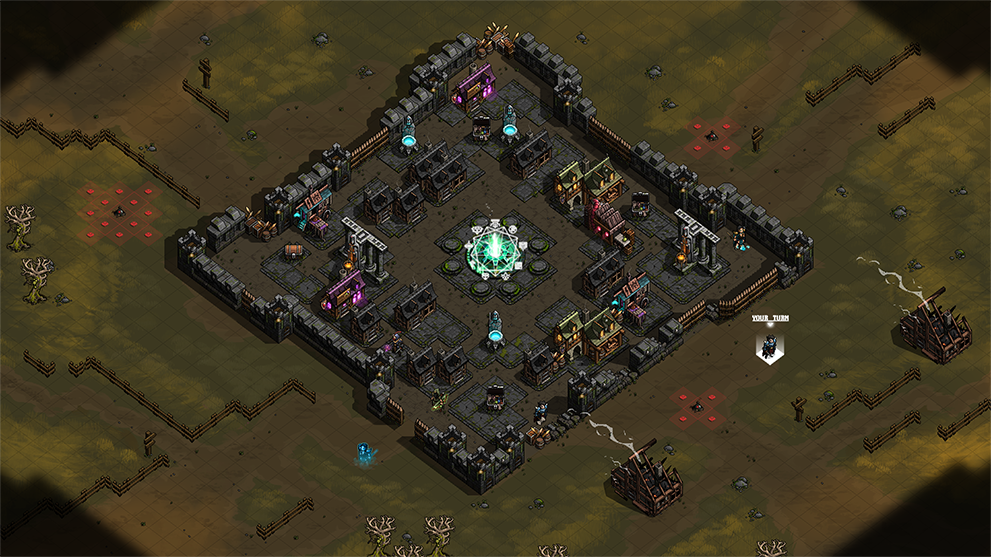
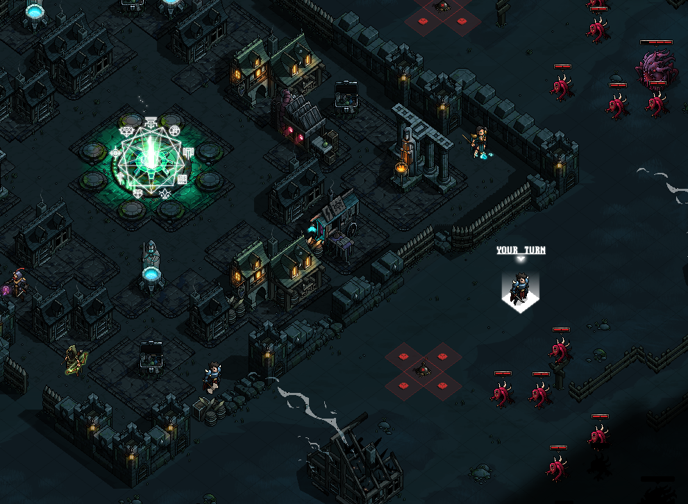
One could say it’s an “asymmetric tactical”. In other words, we wanted to make a Tactical RPG where the player would lead a handle of heroes against hundreds of enemies. An interesting challenge – although a little scary – for developers, whether it be for the design, the code or the art…
As for me, the very first challenge was clear: make a concept art of the game that would represent a Tactical where you could display hundreds of enemies on screen, and that would prove that it can visually work.
Usually, “Tacticals” show a grid, I needed to find out the “right” size of that grid to show a number (that was still unsure, but probably quite high) of units, elements of scenery, and elements of basebuilding on the battlefield. In other words, this was pure fortune telling at this point, but we had to try nevertheless. I hence made those images below:
Those images allowed us to consolidate even more our vision of the game by offering a first representation of what was previously words and intentions (“a game in which you lead a team of hardened heroes to defend the last bastion of mankind against hordes of monsters”), but as an artist it was even more interesting, regarding the art direction of the game. By forcing ourselves to concretely produce elements for the game, those pictures allowed us to become aware of some very big constraints that it would be hard to ignore afterwards.
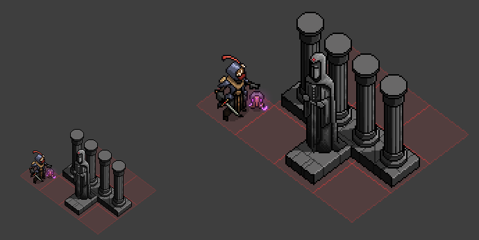
1st realization : Grid orientation
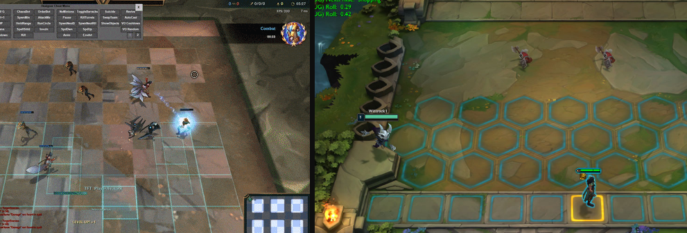
It’s actually a recurring problem in games where too many high elements hide smaller ones behind them, preventing the player to click on it (except by developping convoluted solutions). It’s often more simple to restrain yourself than try and minimize the issue (“it’s no big deal”) or to hide it until the game’s release. Here are two very meaningful examples, one old and one recent:
In “The Last Spell”, as you may have guessed by comparing the first two pictures, we “solved” the problem by changing the orientation of the grid for a higher point of view and by forcing ourselves not to create elements that are too high. Spoiler: there will still be issues but they’ll still be less frequent…
2nd realization: the number of available pixels by tile
This seemed obvious: a higher number of tiles displayed on a PC monitor = a smaller number of available pixels to show ONE element of gameplay, whether it be a hero, an enemy, a bulding, etc.
However, once again, it’s only by concretely making those graphical elements that you become aware of the difficulty of some tasks that used to look “manageable”…
It’s important to note that in most games, the 2D graphical elements are very often created by artists at a higher size than their actual ingame size. This allows the artist to work on a higher area, with more details and all you need to do is export a smaller version of the element. Judge for yourselves:
There’s still a price to pay for that: the reduction of the size of the element will be made by an algorithm (like the one in Photoshop for example), and the artist will have a limited control on the aspect of the final element (unless they rework it, but it’s far from being the ideal workflow ;)). Like the example below shows, I quickly experimented this frustration several times while I was making this concept and I came to the conclusion that it could be a problem during the game development…
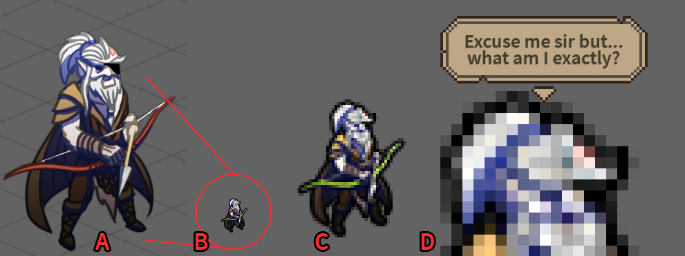
B: The exported and automatically reduced version by photoshop for the game (a black outline had to be added because it was so… unconvincing)
C: (Zoom 400%) The same as before but zoomed to better see those horrible pixels
D: (Zoom 800%) An unspeakable pixelated abomination
Indeed, if the room that we have on screen is so critical and our number of pixels so limited, there’s not much sense in working with sprites that are 4 times bigger to get such a mediocre result at the end, and that could have been much better, had we directly done… pixel art.
Having previously worked on pixel art projects during my studies, I could clearly see what could be the benefits, artistically, to make the game like this. Besides, a few months before there was a small indie “Tactical” that was brillant and that some of us had played a lot: some game named “Into The Breach”.
The solution
With those new constraints and inspirations in mind, I then made a quick test to see what heroes and one building in pixel art would look like, with a grid that was closer to the one in “Into the Breach”.
I was more convinced by the control that this new work method on the final rendering in the game gave us, and no matter the zoom. After a few more weeks of work, I got this second version of the concept art, much closer to the current game.
One last story about the art direction
There could be many other things to say but for today here’s one last story about the game’s art direction.
The most attentive ones may have noticed it but at the time of this concept art the “outlines” of the different elements were all made of pure black, and mainly for reasons of creation speed (and I can guarantee you that even like that this concept art was not quick to make at all!).
By building on a few more weeks of reflection – and more perspective about our production speed – I was able to “take the time” to include color in those outlines. Yes, that meant I had to rework a big number of assets from our first “mood trailer” for example… One of the first decision that I hope will be worth it in the long term and that will allow you to appreciate “The Last Spell” even more.
That’s all for today about the game’s art direction! If you have any question, feel free to put them in the comments 🙂
-The Last Team
Follow us!
Tip: You can quickly comment these blog post entries just by entering whatever email
Views: 4301